Building a Monthly Email Marketing Report: What to Track and How to Present It

A monthly email marketing report serves two purposes: it tells you what happened, and it tells you what to do next. Most email reports fulfil the first purpose reasonably well and completely fail the second. They’re backwards-looking summaries that generate a “looks good” or “not great” reaction and then get filed. Nothing changes.
This guide covers what to include in a monthly email report, how to structure it for different audiences, how to visualise trends that make performance legible, and how to turn reporting into an active planning tool.
What to Include in a Monthly Email Report
Section 1: Automation Performance
Flows should be stable and compounding month over month. The automation section of your report covers:
Revenue by flow
List each active flow and its total attributed revenue for the month. Track this as both an absolute number and as a percentage of total email revenue. The goal is for automation’s share to grow over time as you add flows and optimise existing ones.
Email-level performance for each flow
Within each flow, which specific emails are performing and which are underperforming? A welcome series that has a strong email 1 open rate but a collapsing click rate by email 3 signals a content or timing problem in the middle of the sequence.
Flow health flags
Any flows that show unusual drops in performance, unexpected low trigger rates, or zero revenue (which can indicate a configuration problem) should be flagged explicitly rather than buried in the data.
Section 2: Campaign Performance
Campaigns vary more month to month than flows, so trend context matters here.
Summary of sends
List every campaign sent in the month: date, subject line, segment, recipients, click rate, revenue, RPR (revenue per recipient).
90-day trend for key campaign metrics
A single month of campaign data is noisy. The report should always show campaign click rate and RPR against the 90-day average so that this month’s results are contextualised.
Top performer and lowest performer
Flag the best-performing campaign (and why — what was different about it?) and the worst-performing campaign (and why — what can be avoided next time?).
A/B test results
Summarise any A/B tests run during the month: what was tested, which variant won, and what was the learning. These should be captured in a running log that persists month over month.
Section 3: List Health Trends
List size and net growth
Total list size at end of month vs end of previous month. Net new subscribers (acquisitions minus unsubscribes). Net growth rate as a percentage.
Engaged subscriber rate
Percentage of total list that is engaged (opened or clicked in the last 90 days). This should be tracked as a trend — a declining engaged rate is an early warning sign worth addressing before it affects deliverability.
Acquisition source breakdown
Where did new subscribers come from this month? Pop-up forms, checkout opt-in, paid lead capture, organic? If one source is declining, that’s a signal to investigate.
Section 4: Deliverability Health
Spam complaint rate
Month average from your ESP and from Google Postmaster Tools. Flag anything above 0.08%.
Domain reputation status
From Google Postmaster Tools: High/Medium/Low/Bad. If it’s deteriorated from last month, explain why and what’s being done.
Bounce rate
Hard bounce rate for the month. Any campaign that produced an unusually high hard bounce rate should be noted.
Section 5: Key Wins, Issues, and Next Month Priorities
This section is where the report becomes a planning tool rather than just a summary.
Key wins: 2–3 things that performed better than expected this month, with a brief explanation of why
Issues: 2–3 things that underperformed or need attention, with a brief root cause hypothesis
Next month priorities: The 3–5 specific things the email programme will focus on in the coming month, directly connected to the issues and opportunities identified in the report
Without this forward-looking section, a monthly report is archaeology. With it, the report drives decisions.
Structuring the Report for Different Audiences
Not everyone who reads the report needs the same level of detail.
Operator view (for the email manager or agency)
This is the full report — all sections, all data, flow-level details, individual campaign performance, A/B test results. The operator view is where decisions about specific flows, content strategies, and technical configurations get made. It should be detailed enough to identify exactly where to focus next.
Executive view (for a founder, CMO, or leadership team)
The executive view surfaces only what matters for strategic decisions:
- Total email revenue this month vs last month vs same month last year
- Email revenue as a percentage of total store revenue
- Automation revenue share
- The 3 key issues and the 3 next priorities
Leaders don’t need to know which specific welcome series email had the lowest click rate. They need to know whether the email programme is growing, whether it’s healthy, and what the team is focused on improving.
Build the executive view as a one-page summary at the front of the full report, or as a separate brief that can be shared independently.
Visualising Email Trends Over Time
Raw numbers in a table are hard to interpret at a glance. Visualisations make trends legible.
The most useful email marketing charts
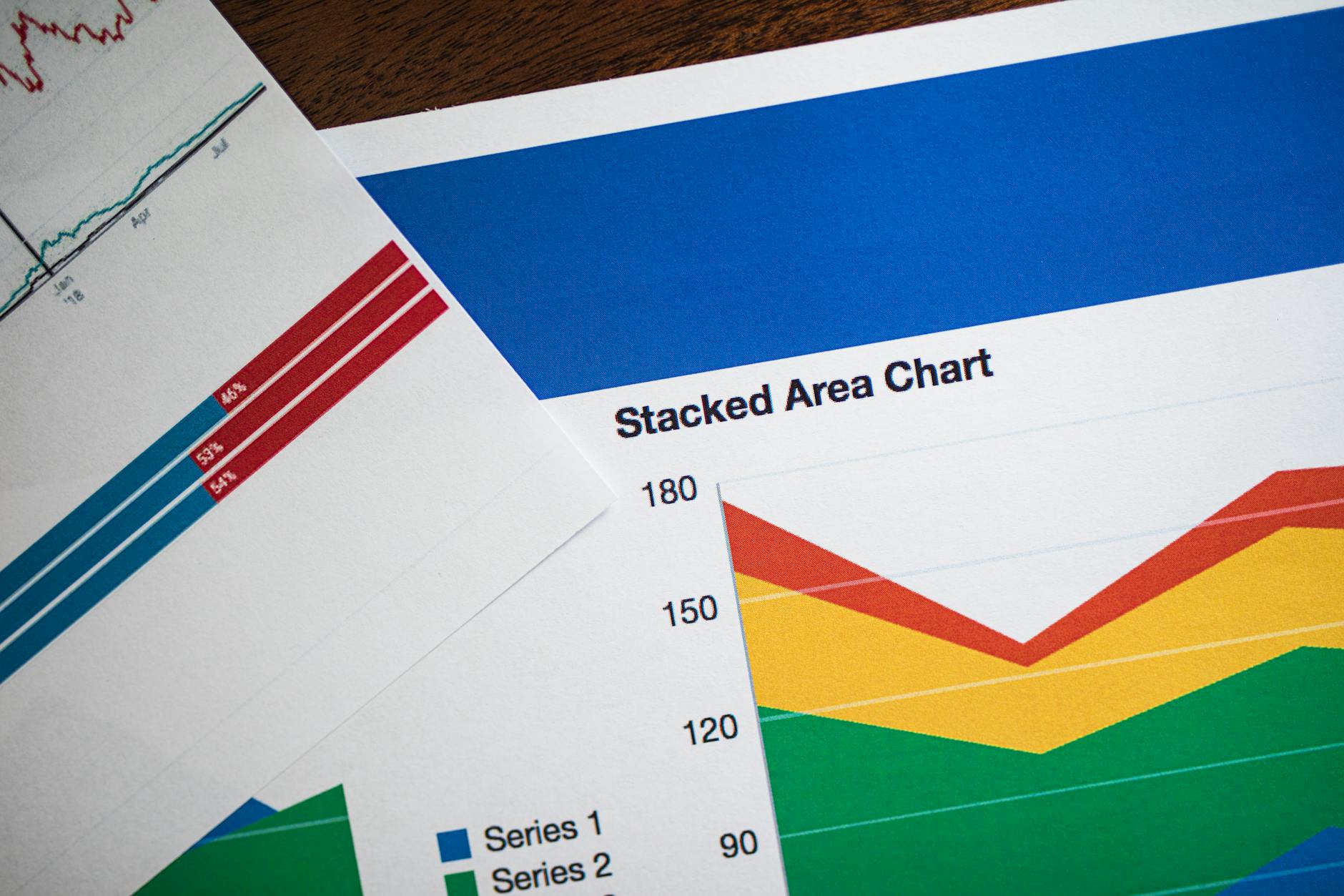
Revenue trend line: Monthly email-attributed revenue plotted over 12 months, with the automation/campaign split shown as a stacked area. This single chart communicates the health and direction of your programme better than any table.
Click rate trend: 90-day rolling average campaign click rate plotted month by month. This smooths out week-to-week noise and shows the genuine direction of engagement.
List growth waterfall: A monthly waterfall showing new subscribers, unsubscribes, and net growth. This makes list health dynamics immediately legible.
Automation revenue by flow: A horizontal bar chart showing each flow’s monthly revenue contribution, sorted by value. The relative contributions become visible immediately.
These four charts, updated monthly, give anyone looking at the report an instant understanding of programme health without reading a single data table.
Presenting Benchmarks in Context
Email benchmarks are useful for context but need to be applied carefully. Industry averages vary significantly by vertical, list size, and geographic market. A 2.5% click rate is good or average or poor depending entirely on your context.
The most useful benchmark in your report is your own historical performance. Tracking your click rate against your own 90-day average is more meaningful than tracking it against an industry average from a report that aggregates thousands of very different businesses.
Where industry benchmarks are useful: when you’re diagnosing whether a metric that seems normal for you is actually below what’s achievable. If your click rate has always been 1.2% and industry data shows similar brands averaging 2.5%, that’s a signal worth investigating. But if your programme is consistently improving its own benchmarks, that’s the primary success signal.
Turning Reporting into a Planning Tool
The shift from backwards-looking reporting to a planning tool happens in three steps:
Step 1: Connect findings to actions. Every issue identified in the report should have a corresponding action item. Not “open rates were lower this month” but “open rates were lower this month; we’ll test a subject line format change in the next 3 campaigns to investigate.”
Step 2: Close the loop from last month. At the start of each month’s report, revisit the previous month’s priorities. Did the actions get taken? Did they produce the expected results? This creates accountability and learning.
Step 3: Build a rolling 90-day view. The monthly report should include a running list of what the programme is working on over the next three months. This prevents the reporting cycle from being purely reactive — you’re executing a strategy, not just responding to last month’s data.
Reporting without planning is housekeeping. Reporting with planning is programme management.
At Excelohunt, we build and deliver monthly email programme reports for our clients in the format above — combining full performance visibility with clear forward priorities. If you’d like expert-led programme management with structured reporting, let’s talk.
Related Excelohunt Services
Looking to implement these strategies with expert support?
- Reporting & Analytics — learn how we implement this for clients Book a free strategy call with Excelohunt →
Want Us to Implement This for Your Brand?
Get a free email audit and see exactly where you're losing revenue.
Get Your Free Audit